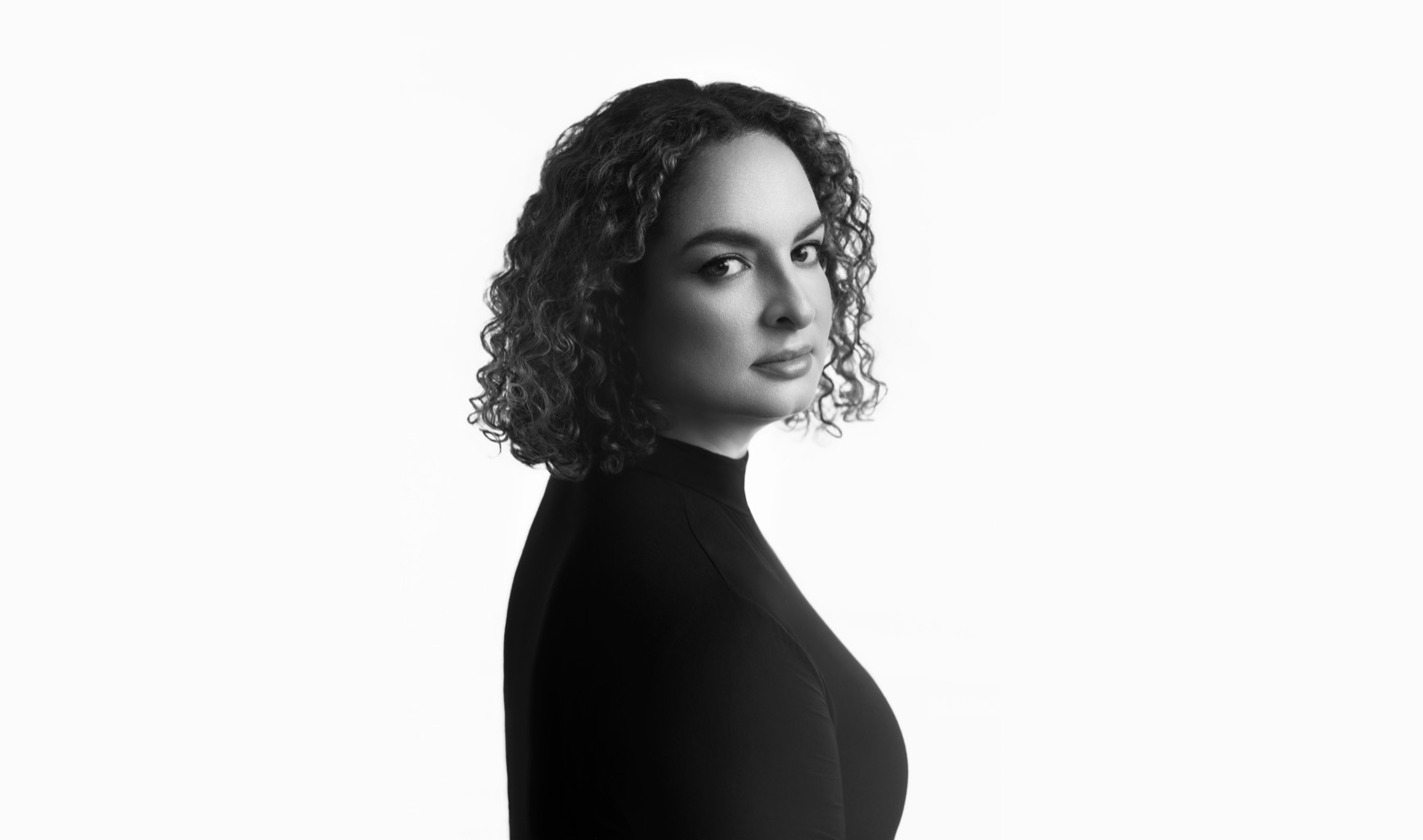
Hello, I’m Thalia.
I design icons for a living, which basically means I spend a lot of time thinking about tiny shapes.
I started my career at Apple as a type design intern and stayed for more than a decade. What began with letterforms grew into a practice centered on icons: small shapes that help people navigate, understand, and feel at home in an interface. During that time I became the lead designer of SF Symbols, Apple’s library of iconography, and designed more than 10,000 icons for a visual language used by millions of people every day.
Working at that scale taught me to care about the smallest decisions. A curve, a little extra space, or a shift in proportion can change how a symbol reads. I’m interested in that balance between precision and perception—how something carefully constructed can feel simple and familiar.
Today I lead iconography at OpenAI, bringing that same attention to shape, clarity, and consistency to my work. Through talks and the writing I share here, I also make room for the stories behind those decisions: the things you learn by looking closely, drawing again, and asking why a shape works.
Letterpress
When I’m not designing icons, I’m usually printing them. My press shop, tilde press, is where my love of typography and small shapes becomes something I can hold. My shop is home to a Vandercook 4, a Chandler & Price, a Pearl 3, and a Chandler & Price Pilot. I use them to experiment with metal type, ink, and paper.
Letterpress gives me another way to think about the same questions I explore on screen: proportion, spacing, texture, and how much a small detail can change the whole. The materials become part of the design, too—the surface of the paper, the ink, and the impression left by the type. It’s a space to slow down, work with my hands, and keep exploring the connection between letters and images.